KIID Repository
Designing Morgan Stanley's "Digital Vault" — an encrypted repository for clients to store and share life's most important documents with their financial advisors, with two-way sharing and enterprise-grade encryption.
Year
2021
Type
Web — SaaS Repository Portal
Client
Morgan Stanley (Infosys + WONGDOODY)
Problem & Context
PayU operated two separate consumer apps — PayU Payments and PayU Finance — with overlapping users, fragmented experiences, and a combined reputation problem: the Payments app sat at a 1.4 Play Store rating. Users who needed both payments and credit had to juggle two apps with different patterns, logins, and support paths.
Key problems:
1.4 Play Store rating — deep user distrust, review sentiment dominated by complaints
Two apps, two codebases, two design languages for one brand and overlapping users
Credit users forced to switch apps mid-journey for payments and vice versa
Duplicated KYC, login, and support flows across both apps
Fragmented analytics — no unified view of the consumer relationship

/01

Research & Discovery
Play Store review mining — categorized complaints across both apps to find rating drivers
User journey mapping — where users crossed between payments and finance needs
Feature inventory + overlap analysis across both apps
Competitive analysis — Paytm, PhonePe, and other Indian super apps
Stakeholder alignment across Payments and Finance business units

View Atrifacts
/02
Key Insights
The rating problem was a trust problem:
Top complaint categories were failed transactions with no status visibility, and support dead-ends — not missing features. Fixing feedback loops mattered more than adding capability.
Users didn't know two apps existed:
Many Finance users discovered payment features existed only in the other app through support calls. The split was invisible until it hurt.
A merger is a migration problem:
The design challenge wasn't the unified app — it was moving two existing user bases without breaking their habits or their active credit lines.
Navigation must serve two mental models:
"I'm here to pay" and "I'm here to manage my loan" are different modes. The IA had to serve both without forcing either through the other's funnel.
/02
Design Decisions
Unified home with mode-aware modules
What: A single home surface with payments and finance modules, prioritized by the user's actual usage pattern.
Why: Rather than forcing a single hierarchy, the home adapts — heavy credit users see loan status first, payments users see pay actions first. Both mental models served.
Transaction status transparency end-to-end
What: Every transaction shows a live status timeline — initiated, processing, completed/failed — with failure reasons and next steps.
Why: Failed transactions with no visibility were the #1 rating killer. Transparent status with actionable failure states directly attacked the trust deficit.
/05
Single KYC, single login, migrated accounts
What: One identity across payments and finance, with a guided migration flow for existing users of both apps.
Why: Duplicate KYC was both a user burden and a compliance risk. The migration flow preserved active credit lines — the highest-stakes constraint of the merger.

Final Designs
The complete Partner Journey
From discovery to first incentive — 4 key stages, each redesigned to remove human dependency from the critical path.
/07


Login & Onboarding
Streamlined login with 2FA built in, followed by onboarding that leads with trust — "Join the 5 lakhs+ businesses," security assurance, and value framing before a single form field. Merchants know why they're here before they're asked for anything.

The All New
Homescreen
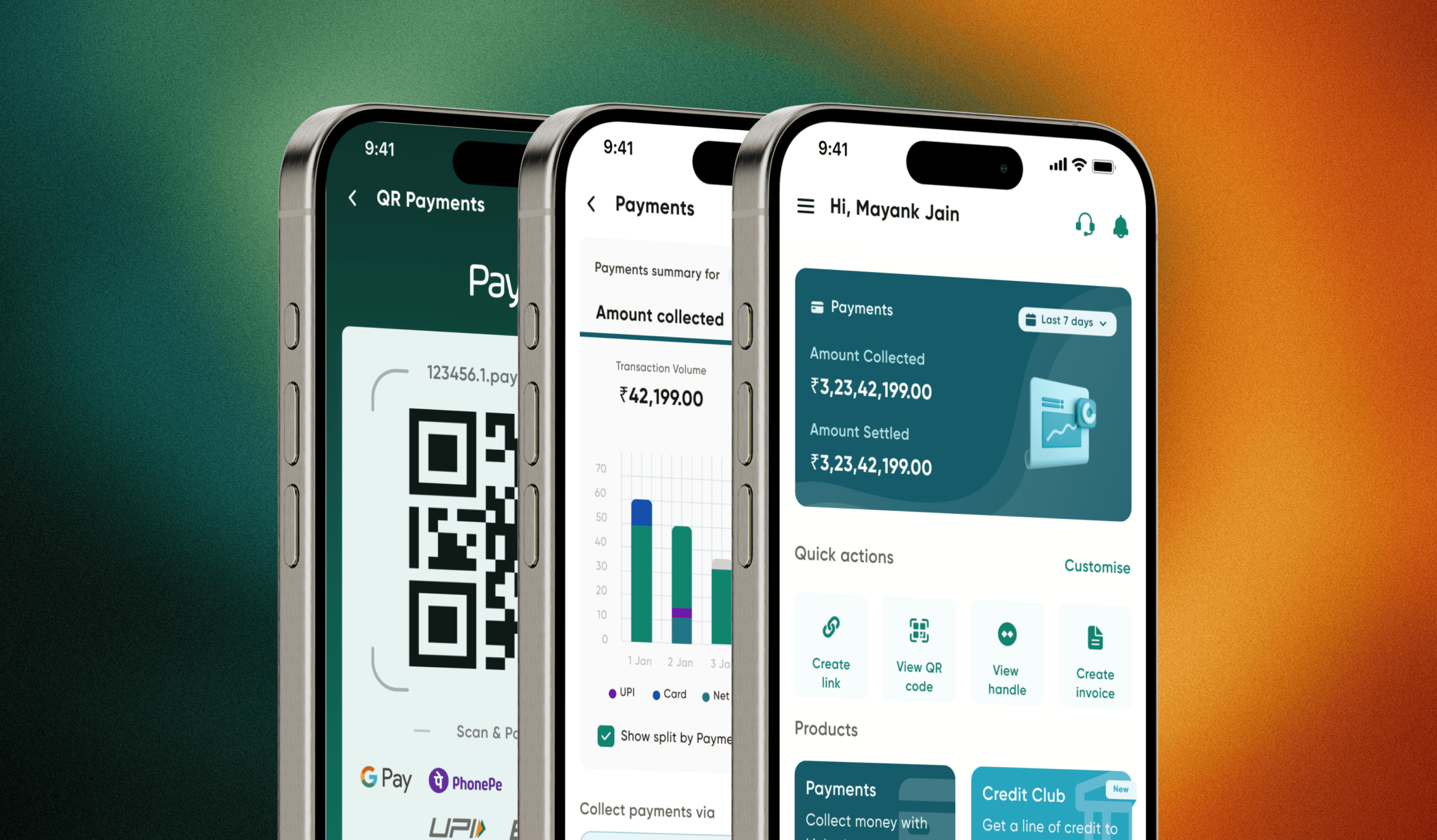
Welcome to the redesigned PayU Mobile App, where simplicity meets power in the palm of your hand. Our new Home Screen is designed to provide you with a seamless and intuitive experience, empowering you to manage your payments effortlessly.
Product Suite — New Feature
Every way to collect, one home. A unified payments hub bringing QR codes, payment links, handles, invoices, and in-person payments into a single surface — with a live summary dashboard, mode-wise transaction splits, and drill-down to settlement-level detail with refunds one tap away.
QR Code Payments
Experience the future of seamless transactions with PayU's QR Code Payments feature. Say goodbye to lengthy account details and hello to instant, secure payments. Simply scan or share your personalized QR code to make or receive payments effortlessly.
It's the fastest, safest way to transact – putting the power of PayU in the palm of your hand. Try QR Code Payments today for a smarter, swifter payment experience. Pay and get paid with just a scan!
User Testing
Testing the application by rolling out to 30% of the merchants.
Research Goals:
Determine how design change in the application is affecting users
Determine if app is hard to use
How Invoice and Links update are helping people
Research Questions:
Are users to use the application?
Are there any parts of the flow that users struggle with?
Can users easily navigate to different parts and products of the application ?
How users are reacting to the UI / UX Changes in the application ?
/08
KPIs:
TAT : To compare the TAT to use the PayU products in comparison to older version
User Error Rates : How users are struggling to perform a task
Conversion Rates : How many customers are able to complete the task
App Engagement : How avg. time users are spending on the application.
Methodology and Participants:
Unmoderated usability study
Participants are existing PayU merchants.
Merchants are categorised in Only App users, Only Dashboard users and who uses both the platforms
Outcomes & Impact
Play Store rating (from 1.4)
3.2
Downloads
2 Lakhs +
Increase in MAU
+70%
Product Engagement
60%
Play Store rating climbed from 1.4 to 3.2 — sentiment shift visible in review language
2 lakh+ downloads of the unified app
Two user bases migrated without disruption to active credit lines
Single design language and codebase — faster feature velocity post-merger
/08
Reflections
What worked:
Review mining as the prioritization engine — the roadmap wrote itself from complaint data
Treating migration as the core design problem, not an afterthought
Attacking trust (status transparency) before adding features
What I'd do differently:
Phase the migration more gradually — support volume spiked in the first weeks
Invest in offline/poor-network states earlier — a large slice of failed-transaction complaints traced to connectivity
/09
Email:
hello@sagarkumar.site
Phone:
+91 70668 72321
I work with brands to define who they are, design how they show up, and create experiences that matter. Less noise, more intention.
Privacy Policy
Terms of Service